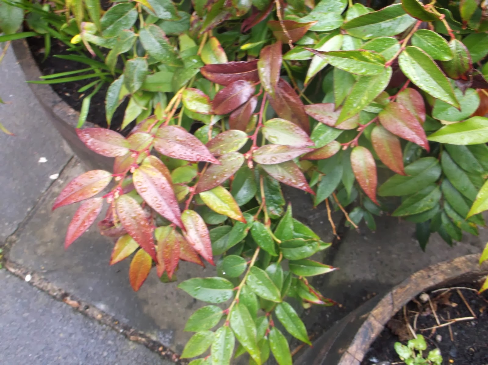
The subject of this photo is a close up image of a leafy plant, which is differently coloured. This photo was taken because it uses bright colours and I thought that it would fit relevantly in to the category of the concept of plants. As the colour red is only used in one part of the photo, it makes it more bold and stand out more, rather than green being the main focus of the image. If you look closely you can see droplets of water on the leafs which brings texture to the photo. I feel that this photo could be improved by focusing more on a little section of the plant in contrast to a larger area of it. This would help focus the eye on the actual plant rather than the surroundings. Some people like this photo due to the red colour in the middle section however they would like it more if the image fitted with the rule of thirds.

the subject of this photo is a leafy plant similarly to my photo is coloured with reds and greens. differently this photo focuses more on its surroundings rather to the plant itself. I like this photo as it uses different objects such as rocks which are placed behind the plant which adds more interest to the photo. I also like the way it uses different textures such as rough and smooth which are featured in the large rocks and some of the leaves in the bottom right corner. This photo features a variety of lines and bright colours which helps give this photo a sense of character. I feel that this is a good example of a close up because it uses lots of colours, lines and textures which all should be included in any image.


No comments:
Post a Comment