The subject of this image is a medium shot of buildings that are in disrepair. This photo uses various lines and different shapes. These elements helps draw the viewers attention to certain areas in the image. The lack of bright colours and the tarnishes on the building makes this photo suitable for my chosen category of buildings in disrepair. The different shapes seen in this image our the many rocks that are placed in a vertical lines in front of the building. This image also uses the rule of thirds as it is focused to the left hand side of the image. Using this technique immediately draws the viewers eyes the object that is placed to the left hand side. As I took the image at a certain angle, It makes the building and its surroundings look longer and further away. I think that this photo could be improved by taking the photo when it is dark with some lights on to further empathise the run down state of the building. Some class mates have viewed this image and agree that to improve this photo I should use different lighting, they also suggested that I should use a different shot for example a close up, which will help pronounce the disrepair and rundown state of the building.
professional photo
The subject of this image is a medium shot of a building that is in disrepair. Similarly to my image, this photo uses dull colours and a good use of lines. The cracks in the stone which is seen in the staircase leading to the building, and the damp surrounding the windows, showcases the rundown state of this building and clearly shows a state of disrepair. I like how this image was taken at an angle because it gives a different perspective on the image but it also creates the illusion that the building is longer and further away, similar to the photo that I took. In conclusion I feel that this image is a good example of a medium shot however I feel that it could use a rule of thirds as it will show more of the surroundings.
Monday, 31 March 2014
Thursday, 27 March 2014
Evaluation
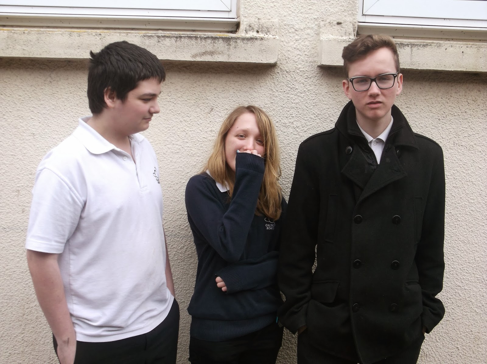
The subject of this photo is a medium portrait shot of friends. This photo includes a good use of lines; which helps draw the viewers eyes in certain areas of the photo, and a range of colours. This photo has a meaning to me as it includes me and one of my friends. I also like the way that it was taken at an angle because it creates an illusion that we are sitting at an angle when reality we are not. elements that make this photo work are the many use of lines and the angle of which the photo was taken as it is a different example of a usual portrait. The bright colours used in the backdrop helps the people which are the main focus of the image to stand out more. It also helps that they are wearing contrasting colours. This photo could be improved by zooming in more on the faces and I feel that perhaps the colours in the backdrop could be brighter. People have viewed this photo and think that it is a creative and different take on a portrait however could use the rule of thirds as they feel that the photo is too central. professional photograph
The subject of this image is a close up shot of two people leaning against a railing. This photo uses a varied use of different bright colours and similarly to my photo above uses some use of lines which focuses the viewers eyes on a certain area of the image. Differently to my photo, the photographer has taken a more traditional take on a portrait as the image focuses on the peoples waste and upwards. Also the image is focused more to the right hand side which is using the rule of thirds, which is a good technique to use as it helps focus the viewers eyes on the whole picture rather than different areas. Also as it is a close up there isn't much to look at so the part that you want to be the main focus stands out. I like this image as in contrast to the people the background uses a plain light blue. This helps the people stand out and be the main focus if the image. in conclusion
The subject of this image is a close up shot of two people leaning against a railing. This photo uses a varied use of different bright colours and similarly to my photo above uses some use of lines which focuses the viewers eyes on a certain area of the image. Differently to my photo, the photographer has taken a more traditional take on a portrait as the image focuses on the peoples waste and upwards. Also the image is focused more to the right hand side which is using the rule of thirds, which is a good technique to use as it helps focus the viewers eyes on the whole picture rather than different areas. Also as it is a close up there isn't much to look at so the part that you want to be the main focus stands out. I like this image as in contrast to the people the background uses a plain light blue. This helps the people stand out and be the main focus if the image. in conclusion
Monday, 24 March 2014
evaluation of nature photos

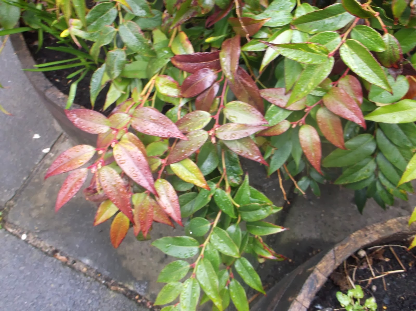
the subject of this photo is a leafy plant similarly to my photo is coloured with reds and greens. differently this photo focuses more on its surroundings rather to the plant itself. I like this photo as it uses different objects such as rocks which are placed behind the plant which adds more interest to the photo. I also like the way it uses different textures such as rough and smooth which are featured in the large rocks and some of the leaves in the bottom right corner. This photo features a variety of lines and bright colours which helps give this photo a sense of character. I feel that this is a good example of a close up because it uses lots of colours, lines and textures which all should be included in any image.
Thursday, 13 March 2014
Monday, 10 March 2014
Subscribe to:
Comments (Atom)


