Thursday, 30 January 2014
close up images 2
This image follows the rule of thirds as it is focused to the right hand side. The background of this image is blurred which helps the rhino stand out more, as it is the main focus of the image. The tree in this image uses texture as the tree looks bumpy and rough.
close up images
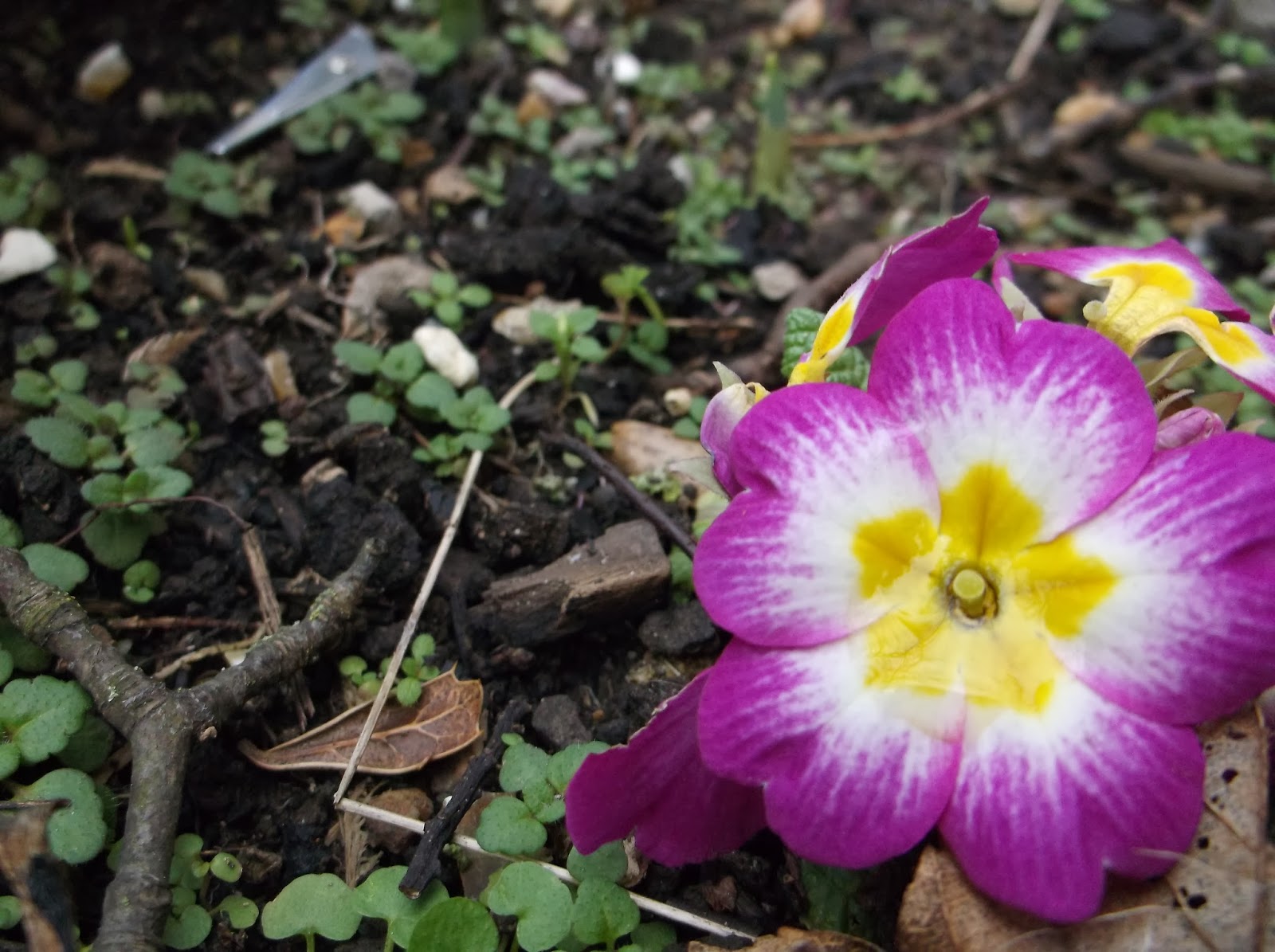
This photo does fit in with the rule of thirds because the main focus of the image is placed to the right. This image showcases bright and vibrant colours which helps exaggerate the detail on the flower, which uses various sizes of lines.
This photo is a good example of a closeup as the back round is blurred which helps the flower still be the main focus of the image.
Like the photo above, this image also fits in with the rule of thirds as it is focused to the left hand side. Similarly this photo also uses bright colours.
This photo is a good example of a closeup as the back round is blurred which helps the flower still be the main focus of the image.
Like the photo above, this image also fits in with the rule of thirds as it is focused to the left hand side. Similarly this photo also uses bright colours.
Thursday, 23 January 2014
Monday, 20 January 2014
Thursday, 9 January 2014
rule of thirds
This is the original image that I will later crop to make it work with the rule of thirds, which will give this picture a better frame. As shown, this photo does not fit in with the rule of thirds because it is placed to much in the center.
I have used the cropping tool on Photoshop so the image is focused more on the left hand side of the image. This showcases the rule of thirds because the main part of the image isn't in the center.
I have used the cropping tool on Photoshop so the image is focused more on the left hand side of the image. This showcases the rule of thirds because the main part of the image isn't in the center.
Subscribe to:
Comments (Atom)


